Saturday 20 June 2009

Reflection on all of our research...

We completed our audience questionnaire in our group, bringing together our results in order that we had sufficient and a range of information in order to aid us in creating our product. We each asked around 40 people ranging our results. Our questionnaire contained both demographic and psychographic information, including quantitive and qualiative data. We used this when creating our detailed audience profile, we now know exactly who is it that we are aiming the product at and can base our cross media campaign on this information to ensure that we carry this out successfully. We then created graphs and tables displaying our results so that we could access these easily.

In our group we decided on the genre of POP Rock, we are all focusing on our analyses in order that we can develop ideas for our product with key codes and conventions. We often used BBC radio one's chart list to look at the CD covers and videos as this lists singles under the heading of our genre.

Analysis of results (brief):

The majority of the people we asked were between the ages of 17 to 22. We tried to vary the age ranges but people of this age range were easily accessible to fill out our questionnaires and we mostly know people of this age range. We think that this is going to make a difference to our overall results.

The majority of the people we asked were female; again, although we tired to vary it we tended to ask more females than males.

The overall preferred genres were dance, rock and pop so we went with the genre of pop rock after researching both pop rock and dance music and also videos and CD covers. Our genre result is definitely affected by the age range that we asked especially since genres such as alternative, world and country were preferred by no one that filled out our questionnaires.

Most people said that the cover is important to them; this would influence their choice heavily and would need to grab their attention.

Target audience ( Audience Profile):

From creating our questionnaire we were able to create our audience profile so that we knew exactly who our target audience was and who our product was to be aimed at.

We decided to aim it at both genders however more towards females, this was perhaps affected by our results as we tended to ask slightly more females than males.

We decided that they would be of the age 16-25 as this is the age range determined from our questionnaire; this is also the age range that would more than likely be listening to these songs as part of nightlife and social occasions.

Codes and conventions:

We will use the codes and conventions of CD covers and videos in order to conform to our genre so that we create our product effectively.

Music video: We analysed 6 music videos from our genre of Pop Rock. We found that in order to conform to the genre when creating our product we need to keep in mind that there are very specific conventions for the videos of our genre such as the following:

- Intercuts are used to link scenes and characters
- Lighting is often natural to add to verisimilitude
- A direct mode of address is often used
- Colours are often quite plain and natural
- The editing is very fast and pacy linking to the style of music
- Costume plays a major part, establishing artists and setting up a 'look' meaning that they easily recognisable.
- Often a male or a relationship is featured in the video
- Some kind of performance whether it's the artist singing at someone or the artist performing for a crowd.


family:verdana;">Magazine posters:

Originally we had trouble in finding 6 print adverts. We looked in magazines and on the Internet but these are proving hard to find. Perhaps this is due to this no longer being such a popular way of advertising.

We have looked online and have been to magazine shops yet haven't been able to find adverts for our genre of music. We have been able to find many adverts for rock in magazines such as Kerrang but magazines such as 'Smash Hits' and stereotypical music magazines are no longer available. We also looked at MixMag but again didn't find an advertisement for our genre. We think that we had so much trouble as we were looking for an advertisement promoting specific tracks by the artist.

We considered other ways of advertising such as billboards yet still struggled to access these. We have used many search engines such as google and ask.com. We have looked for both adverts to promote artists and albums yet have been unsuccessful.

The significant absence suggests that advertising and promotion through magazines is no longer such a useful or such a efficient way of promotion. In recent years technology has advanced so much that provides a much more efficient way of advertising.

We are going to look at the supplement in the Times newspaper, even if we are unable to access advertisement for our genre, at least we will be able to analyse various adverts and get a feel for them. This will more than likely pose a small problem when we create ours as we won't have any specific codes and conventions to follow, we will have to be very careful in doing this as we could make a grave error.


We have since brought The Times, however this proved unsuccessful as we found no print advertisements in this edition for any genres, we have decided to look at the 'new media', we are going to analyse 'my space' pages, most of these pages have their own identity when advertising the artists and we believe that this stand us in good stead for creating our advertisement as it will appeal to the younger generation, this being our target audience.


CD covers conventions:
- Features the artist or band, central to the frame
- Uses a direct mode of address
- Copy: lower case or capital lettering or sometimes a mixture of both
- Copy: minimalistic and all that the audience needs to know like band/artist name
- The colours often natural
- The colour scheme from the front cover is carried onto the back, extremley common with the genre.
- Clothing often mimics the style of the music and is quite edgy
- Women artists challenge gender stereotypes, seem out of control


Narrative theory/issues concerning representation:


Often the videos conformed to Todorov's narrative theory, there was a clear linear narrative to establish the story for the audience.

Often the videos challenged Propp's stereotypes as the female artist often had power and status challenging the idea of men holding all the power and dominating women. This is often displayed in 'Pink' and 'Avril Lavigne' these females take dominance and they have status, they aren't controlled by men, challenging society's ideologies concerning gender roles.

There is no 'princess', 'father', 'hero', 'villain', these videos completely contrast with Propp's theory.


We also looked Dyers star theory as we thought that this was appropriate for developing our product for how the star (the artist) is constructed to appeal to the audience. 'The concept of a star is an image. The star persona is constructed in line with the ideologies of the institution and is intended to appeal to the audience. The image often has little relation to the reality of the star.'We know that this will be important in constructing our 'star' in engaging the audiences attention.


Institutional context:

For our institutional research we must consider factors such as record labels, who will sign it? We must also consider websites, what websites can we put the product on? What websites contain music videos? We can look at websites such as channel 4 music. We also need to consider new technology such as IPods, this can affect our product as the image has to be much smaller to fit o a ipod screen and must still be recognisable, and these are things that we must consider. We also need to look into the background of music television, it hasn't always been around. We need to consider also the television channel to put our product on, we have looked at MTV however we know that there are many other Channel's that we could promote our product on, which we could also look further in order to have more background knowledge to develop our product.


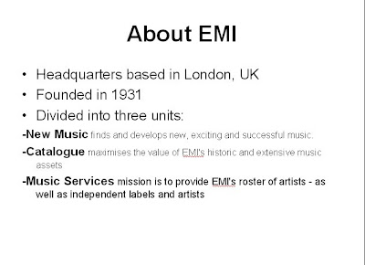
We looked at the history into dance music, we also looked at EMI, the history into EMI, information such as acts signed, how successful they are and how appropriate they are for the band/artist we are using. This is helpful to us as we need to know where we will send our CD, who will be our record label. EMI have a wide variety of artists, they specialise in new and upcoming artists and have been the record label for artists like Lily Allen and The Sex Pistols, they have two categories, also having EMI publishing. They get their money from sales and date back to 1897, being one of the oldest record companies to date.


We also looked into MTV, we thought that this channel was a good match for our genre; also as it is very well known we thought that it would be an appropriate institution for us to research. The people watching this channel would generally be our target audience, they would be fans of pop rock music and expecting this genre, immediately we would have their attention.

It is also important to consider that MTV is a digital channel therefore a subscription to a provider like SKY or Virgin is needed, this means that their audience is slightly limited however in the next few years with everyone going digital this will not pose such a problem. It plays both underground and mainstream videos so has a wide target audience, it also plays tracks that aren't so well known 'up and coming' artists, this would be ideal for our product as the target audience would need to get to know the band well.

Thursday 18 June 2009

Typical Audience profile

Hopefully my audience research will tell me all about the audience that I intend to aim my product at. It will tell me demographic and psychographic information about my target audience telling me their habits and interests within the music industry.

My questionnaire allowed me to analyse quantitive and qualitive data, I tallied the results and put these into charts and tables meaning that I could therefore analyse my data quickly and efficiently. I distributed these randomly however tried to vary the age ranges and genders yet inevitably I tended to hand out more questionnaires to people of my age range, the majority of the people I asked being between 16 and 25, I think that this influenced my results a lot.

A lot of people of this age range would be able to afford new music technologies such as IPods and personal mp3 players and would have money to spend on music with jobs. This age range would also be going out to pubs and clubs, more than likely listening to chart and dance music, this is shown in my results. Dance, rock and pop were the main preferred genres, this was likely to be the results given the age ranges mainly asked, this does affect how valid my results are.

The majority of people I asked tended to download music on a weekly or monthly basis, perhaps due to it being inexpensive with many competitive sites such as Itunes and Amazon competing to sell the consumer music.

The majority of people I asked said that they listen to music from the same artist and the same genre, perhaps showing a loyalty towards their preferred artist and preferred genre. Also many of the people I asked said that they prefer to listen to music on the radio, on the Internet or on a personal sound system rather than music channels suggesting an easily accessible way of consuming music.

The majority of people said that the album cover is important to them, this will be an important factor.


Dyers star theory research

The concept of a star is an image. The star persona is constructed in line with the ideologies of the institution and is intended to appeal to the audience. This image often has little relation to the reality of the star. Richard Dyer has identified key codes and conventions of the star persona:


  • A star is a constructed image, constructed across a range of media and mediums.
  • Stars are commodities produced by institutions.
  • Stars represent particular ideologies for us and are available for us to explore these ideologies- for example, through articles in newspapers or latest gossip.
  • Stardom, and star worship in general is a cultural value in itself, often related to both materialism and ideologies of beauty and sexuality,
  • Stars support hegemony by conforming to it (thin/beautiful) or providing difference (fat/still lovable). Much of the discussion of stars in celebrity magazines is about how stars compare to the hegemonic ideal, and how we compare to the stars.
  • Film stars are represented primarily through their roles- constructed by screenwriters. The screenwriters create the personality and characteristics for them, and their overall image is constructed from many fragmented parts, which may or may not contradict each other.
  • Stars are generally inspirational for an audience- hence why their hairstyles or clothes can be so successful. We feel that if we buy into their culture materially we will somehow also be perceived in the same way.

I thought that this theory was appropriate to look to develop our product for how the star (the artist) is constructed to appeal to the audience.

Wednesday 17 June 2009

Institution research (overview and EMI)

For my institutional research I must consider factors such as record labels, who will sign it? I also must consider websites, what websites can I put the product on? What websites contain music videos? I can look at websites such as Channel 4 music. I also need to consider new technology such as Ipods, this can affect my product as the image has to be much smaller to fit on an ipod screen and must still be recognisable, these are things that I must consider. I also need to look into the background of music television, it hasn't always been around. We need to consider also thye television channel to put our product on, we have looked at MTV dance however there are other channels like Clubland or Flaunt that we could also look further into in order to have more background knowledge to develop our product.


This is helpful to us as we need to know where we will send our CD, who will be our record label. EMI have a wide variety of artists, they specialise in new and upcoming artists and have been the record label for artists like Lily Allen and The Sex Pistols, they have two categories, also having EMI publishing. They get their money from sales and date back to 1897, being one of the oldest record companies to date.
http://en.wikipedia.org/wiki/Music_industry


The music industry sells compositions, recordings and performances of music.
Among the many individuals that operate in the music industry are the musicians who compose and perform the music, the companies and professionals who create and sell the recorded music (eg: music publishers, producers, studios, engineers, record labels, retail and online music stores, also performance rights organizations). Those that present live music performances (eg:booking agents, promoters, music venues, road crew), professionals who assist musicians with their careers (talent managers, business managers, entertainment lawyers), those who broadcast music (Satellite and broadcast radio), journalists, educators, musical instrument manufacturers.


The four 'major labels' that dominate the industry:
  • Sony Music Entertainment

  • EMI

  • Universal Music Group
  • Warner Music Group
These consist of several smaller companies and labels serving different regions and markets.


The live music industry is dominated by Live Nation, the largest promoter and music venue owner.


Other important music industry companies include Creative Artists Agency (A management and booking company) and Apple Inc which runs the worlds largest music store, Itunes store selling the IPod and IPhone.


Tuesday 16 June 2009

(POP ROCK) Conventions for Cd covers and videos...

CD covers:
- Features the artist or band, central to the frame
- Uses a direct mode of address
- Copy: lower case or capital lettering or sometimes a mixture of both
- Copy: minimalistic and all that the audience needs to know like band/artist name
- The colours often natural
- The colour scheme from the front cover is carried onto the back, extremley common with the genre.
- Clothing often mimics the style of the music and is quite edgy
- Women artists challenge gender stereotypes, seem out of control


Videos:
- Intercuts are used to link scenes and characters
- Lighting is often natural to add to verisimilitude
- A direct mode of address is often used
- Colours are often quite plain and natural
- The editing is very fast and pacy linking to the style of music
- Costume plays a major part, establishing artists and setting up a 'look' meaning that they easily recognisable.
- Often a male or a relationship is featured in the video
- Some kind of performance whether it's the artist singing at someone or the artist performing for a crowd.

(POP ROCK) Research

http://en.wikipedia.org/wiki/Pop_rock

Pop rock is a mix of pop music and rock music utilizing a catchy pop style with light lyrics, and (typically) guitar-based songs. There are varying definitions of the term, ranging from a slower and mellower form of rock music to a subgenre of pop music. Scholars have noted that pop and rock are usually depicted as opposites; the detractors of pop often deride it as a slick, commercial product, less authentic than rock music.

Stylistic origins: Pop music Rock music
Cultural origins: 1960s, United Kingdom and United States
Typical instruments: Electric guitar, Bass guitar, drums, vocals, Keyboards, synthesizers
Mainstream popularity: Mainstream worldwide since 1960s


In the 1990s a new genre emerged into the mainstream, combining elements of pop and with punk rock. This new style was termed pop punk, and was popularized by artists such as Blink 182 and Green Day. Billboard magazine considers the pop rock performers or groups from the 1990s to include Ace Of Base. For the later part of the decade, the magazine lists Robbie Williams, Alanis Morissette, Shakira, No Doubt, Hanson, Gin Blossoms, and dc Talk.

(POP ROCK) New media analysis'


(click to enlarge)

(POP ROCK) Video analysis'

Ashlee Simpson- Boyfriend
http://www.youtube.com/watch?v=nGxqpm26-Gk

The video starts off with a zoom in shot on an alley way, from a point of view shot from behind the wheel, this immediately cuts to darker surroundings, in a more derelict and urban area. There is then a mid shot of a cars headlights, this immediately cross cuts to a mid shot of the artist driving the car. The editing is very fast which links to the genre of pop rock.

This is then followed by a close up of the artist driving the car, the shot being of her hands on the wheels, the shot again links back to the alley way with a long shot of the car itself.

The camera then focuses on the artists face, cross cutting to her driving the car. We see that she is being followed by police, this shows the artists rebellious side and that she does not conform to the rules of society, this reinforces her style of music as edgy.

The audience can see that there is a police chase happening, they are following the artist driving the car, again we see a very quick mid shot of the artist driving the car. The cross cuts really establish what is happening for the audience.

The mid shot of the artist then goes on to follow her singing, again there are cross cuts between the artist driving the car, the police cars and various other scenes happening at the current moment in time.

There's a high angle crane shot onto the artist getting out of the car and a close up onto her heels, the clothing she is wearing shows that she doesn't conform to the rules, she's not dressed sophisticated, her clothing style conforms to her conventions.

There is again cross cuts between the artists face while she's singing and whats happening in her surroundings, the direct mode of address in these mid shots engages the audience.

There's a long shot of a performance scene, the artist is singing and around her is the crowd. The setting seems quite derelict like an unused warehouse and the lighting is very natural, adding to the verisimilitude of the scene.

There are various shots of the artist performing, she is always central to the frame of there is a close up on her, showing her importance within the video and that she is the person with the most power and authority. It's important to notice that there are also a few mid shots and long shots of a school scene, this links to the front cover of her CD where she is dressed in what looks like a school uniform.

The people in the video are also young adults and older teenagers, this reinforces the target audience being of this demographic.


Avril Lavigne- Girlfriend
http://www.youtube.com/watch?v=FUqt86nrDYI

The video starts off with a mid shot of the artist, she sees a couple and immediately sings lyrics at the male, the audience sees a two shot of the couple and see this beginning to happen.

There's cross cuts between the artist and the couple to establish the situation taking place for the audience, this then cuts to a performance taking place. The artist is dressed to suit the genre of pop rock by wearing a short skirt and shirt. The image of the skull and cross behind the artist when she is performing links to the CD cover for the artist.

There's a direct mode of address between the artist and the audience, this immediately engages the audience. There's cross cuts between the artist and other scenes linking to her song lyrics. The editing is very fast and pacy, this fits in with the style of music.

There's various intercuts between the artist and the boys girlfriend who the artist is singing about, this establishes a clear connection for the audience, it follows Todorovs narrative theory in that there is a clear linear narrative. There are constant intercuts between the performance and things that are happening with the artist currently, this reinforces the narrative.

There is a mid shot where the artist has a crowd around her, the setting is quite dark and she is central to the frame showing her status. Often there is a mid shot showing all 3 main characters in the shot, this is establishing that she is getting in the way of the couples relationship and trying to break them up, this reinforces her 'couldn't care' attitude that she is trying to put across.


Pink- So What
http://www.youtube.com/watch?v=xRImR4fmWmo

The video starts off with an image of the artists tattoo's, the camera then pans out to reveal the artist fully. The mid shot of her on the small vehicle annoying the drivers behind reinforces that she is in control, she doesn't care. Also that she is drinking out of a can seems to add to the masculinity which is reinforced by the shot of the liquor sign.

The direct mode of address engages the audience, the audience can relate to the artist as is immediately drawn to her, she is also always central to the frame which is important to consider.

The artists costume and hair is quite edgy, even that her hair is quite short is important especially that it is platinum blonde which fits with the genre. The fact that her tattoos are on show displays her as quite masculine rather than feminine, this challenges gender stereotypes.

When the artist is framed, she is framed central to the frame, she comes across as very aggressive, her actions are aggressive along with her singing, this add's to the challenge of gender stereotypes. This is also reinforced by the motorbike.

Again there is a mid shot of the artist with a crowd around her, a performance scene of her singing. There's various mid shots of the artist and a male, she sings at him. The editing is also very fast, it fits in with the style of music.


Paramore- Misery Business
http://www.youtube.com/watch?v=TQnwQ6JtySc

The video begins with a mid shot of the band, followed by a close up of the female of the band, she is the 'face' of the band and is highly important. The setting is dark and inside rather than outside.

The woman is always framed central to the frame, with a direct mode of address to engage the audience, she is also always at the forefront of the frame. Again there are cross cuts from the performance to other scenes.

Again the editing is extremely fast, this links with the genre of music and the style of music.

The artist is dressed to fit in with the genre of music, she's dressed quite edgy and her clothing doesn't conform to common gender conventions, she's very edgy and doesn't come across as overly feminine.

The colours of the setting are quite plain and simple, the black, white and red colours contrast with each other which is what you would expect from this genre of music.

(POP ROCK) CD cover analysis'...

Front cover:


The direct mode of address links to the uses and gratifications theory of the audiences need to relate, it immediately engages the audience and grabs their attention. All the males have a direct mode of address apart from the female, showing that they are focused.She is the creative one and the 'wild child' which links to her look.

The band is dressed quite casually, they look quite at ease and quite 'cool' which is reinforced by the dyed hair and piercings, this connotes that the target audience would be teenagers.

The colours are very plain and simple which isn't something that you would expect from an alternative band, it seems to completely contrast with their style of music.
The image seems unposed and very natural, almost as though it doesn't fit with the genre.

The woman's pose is quite dominant with her arm around the male, we can see from this that she's an important part of the band, she seems central to the group.

The copy for the bands name is in lower case and seems simple, it stands out against the background and has a friendly tone to it. It seems quite laid back which seems to contrast with their music.

The copy 'Misery Business' is all in capital lettering, there is a scribbled effect, this shows their creative side, and makes the title stand out, the way that it's not straight could connote that they don't think their image is as important, it's their music that matters.

By the bands image and the copy contrasting so much to the music genre it really makes the cover stand out, the music doesn't fit their look. Their music is very mainstream in contrast to their look, they probably dress the way that they do to bring in a wider target audience. This is also a convention of the genre, very commercialised music.

Back cover:
Unfortunately I couldn't find the back cover for this CD.


Front cover:


The cover displays a very powerful image, the immediate direct mode of address engages the audience, the audience can relate to the artist and is immediately drawn to her. The fact that she is nearly completely in the frame is important through a mid shot.

There is nothing sexualised about the artist, she appears very thoroughly masculine. The black background keeps the audiences attention focused on the artist, who is the most important person in the frame.

Her costume and her hair is quite edgy, even that her hair is quite short is important, also that it is platinum blonde,this also fits with the genre.

The exclamation mark for the 'I' in her name makes her quite quirky. The capital lettering gives her an attitude added with the exclamation mark, it gives her a doesn't care attitude.

The font colour transition from white to green is important,to display some kind of progression. The audiences attention really draws you to the fact that the name 'Pink' isn't written in pink.

The leather jacket that she is wearing challenges feminine connotations, it shows her as having power, along with the clenched fists which show her as having control,the pose she takes also shows her authority.

I think it's also important to consider that she doesn't fit the connotations of the word 'Pink'. She completely challenges the connotations of her name.

Back cover:
I'm unable to find the back cover, I've looked on the Internet but cannot find the back cover.

Front cover:


The artists hair obscuring her eye which gives a feel of a hidden identity, the direct mode of address is used to connect the artist with the audience also linking to the uses and gratifications theory. The artists blonde hair fit’s in with the stereotypes.

The background of the image is urban and derelict which challenges location settings, the ‘rocked up’ girly image of a heart creates a unique look and gives her a rebellious, edgy style. The stars around the heart almost gives back a pretty, girly style to the image. This really shows the pop, rock theme and the black and pink colour scheme reinforces this.

There’s the red, white and blue colours of the American flag on her back which seems quite ironic as she’s actually Canadian, unless she’s trying to bridge a gap to appeal to younger audiences.

The copy is clear, it’s all in capitals and stands out.

For the image of the artist herself there is nothing to sexualise her, the image is quite neutral and again it almost contrasts to the style of music, the main hint is the copy and image of the heart, especially the cartoon effect against the back image.

Although she’s not central to the frame you still get the complete direct mode of address, it’s very natural image and the setting is natural, she looks like she’s been took away from something, the image is really engaging for the audience.

Back cover:
Unfortunately I’m unable to find the back cover for this CD cover.


Front cover:


The direct mode of address immediately engages the audience and grabs their attention. This links to the uses and gratification theory and the audience's need to relate. The colour scheme of red and black suggests a rebellious side to the artist, the red connotes a dangerous edge to the artist. The artist is framed central to the frame and the mid shot makes sure that the audience focuses all attention on her.

The artist is dressed almost school like in the shirt and tie which could connote her as quite fashion conscious and rebellious. She has quite a sultry facial expression which links to the whole school girl scene and if she is in school then her not wanting to be there, she is more concerned with her music and her fashion. The poise that she holds is strong, showing her to be in control.

The copy is minimalistic, it tells the audience all that we need to know, as the copy is white it stands out against the dark background and so the audience is immediately drawn to this. If the image were to be made smaller to fit on an Ipod screen it would be easily recognisable due to the simple colour scheme.

Also the fact that the copy is at angles suggests that this artist does not conform to rules, this is reinforced by her almost sexualising the school girl pose which would be appeal to male fantasies, which also links to Britney Spears and her similar ideologies. The copy also suggests that she is not 'on the straight and narrow' which challenges gender stereotypes.

The cover isn't particularly a feminine cover so it would appeal to both genders. The 'mise en scene' connotes the pop rock scene, the image connotes that the artist is out of control and that her music will be similar.

From the cover there is no clear information about the artist, plot or narrative, the audience is left guessing and in suspense. This poses an enigma for the audience and encourages them to want to buy the single.

The copy on the front cover is also all lower case, it also has a crackled effect to add to the rebellious edge.


Back cover:


The copy on the back cover is very different to the copy on the front cover however it still fits with the rebel scene.

The red and black colour scheme is carried on from the front. The back cover has all the necessary information on but does not obscure the image. The image is also quite provocative, as you can see her breasts.

It has all the necessary sales information and copyright information on but this is in smaller writing as this isn't important to the consumer.

There's almost a warm feel to the colour scheme, the red is textured and doesn't seem quite so harsh, more than likely linking to the pop element of the music.

Monday 15 June 2009

MTV and Kerrang research for our Pop Rock Genre...

I looked at MTV for our pop rock genre, I thought that it would be appropriate as it is very well known and a very well established institution for us to research, by looking at this we ensure that we know where we will 'send' our product.

The people watching MTV would generally be our target audience, they would be fans of the music played and expecting this sort of genre, therefore we would immediately grab their attention.

It's also important to consider that it's a digital channel so it not available to everyone at this current moment in time. MTV plays both underground and mainstream videos so has a wide target audience, it also plays 'up and coming' artists.

The schedule gives us an idea of when we can target our audience, the peak time of about 5-7pm would be our aim and this is when we would gain most viewers. The schedule is important as is impacts heavily on when we can target our audience.

It's also important to note that the channel demographic is the same as our target audience, this will be a big help when creating our product.


We also looked into kerrang as this also plays some pop rock songs. Again this is a digital channel so we must consider how many of our target audience this will reach. This is also a well known established institution so we thought that this was appropriate to research.

Kerrang plays artists such as Fall Out Boy, Green Day and The Offspring.This could be a bit too rock orientated for our genre and too punk rock orientated. For this reason we would more than likely stick to MTV.

Sunday 14 June 2009

Reflection on advertisment...

Driving home from work the other day, I spotted an advertisment on a small billboard on the side of the road, funnily enough after all our searching, this was advertising Dizzee Rascal and his new album 'Tongue and Cheek', the colours, images, mise en scene were very similar to that I had previously analysed on the MySpace page.

Out today I spotted the Dizzee Rascal poster again:


Friday 12 June 2009

(DANCE) CD cover and video conventions...

CD covers conventions:

-Doesn't always feature the artist. La Roux and Lady Gaga features the artist, if the artist is featured then he or she is central to the frame and there is often a direct mode of address.
- Poses enigmas and creates suspense. For example with KID CUDI VS THE CROOKERS 'DAY 'N' NITE', you have to turn over the CD to fully realise that it's a space helmet on the front cover.
- Capital lettering for the copy, central and minimalistic, all that the audience needs to know.
- Band/ artist name and song name.
- 3 colours used rarely more, this is useful when the cover is made much smaller for Ipod screens, it's still recognisable, also its cheaper limiting to a few colours.
- The colours often mimics the colours of strobe lighting for example lime green.
- Colour scheme from the front cover carried to the back, extremely common with genre.

Video conventions:
- Intercuts are used to link scenes and characters.
- Sometimes intertextuality for example The Prodigy
- Lighting is not natural; it's high contrast and often strobe lighting to mimic a night club.
-Colours are often white, lime green, pink and blue linking to a nightclub/ nightlife.
- There's often a direct mode of address
- The editing is fast and pacy again linking to a nightclub referring back to the genre of dance.
- Costume plays a major part, establishing artists and setting up a 'look' meaning they are easily recognisable.

Print analysis research and 'new media' analyses

Currently, I'm having trouble in finding 6 print adverts. I have looked in magazine's and on the Internet but these are proving hard to find. Perhaps this is due to no longer being such a popular way of advertising.

I have looked online and have been to magazine shops yet haven't been able to find adverts for either dance or pop rock music. I've been able to find adverts for pure rock music in magazines such as kerrang but magazines such as stereotypical music magazines are no longer available,

I considered other ways of advertising such as billboards yet still struggled to access these. I have used many search engines such as google and ask.com. I have looked for both adverts to promote artists and albums yet have been unsuccessful.

The significant absence suggests that advertising and promotion through magazines is no longer such a useful or efficient way of promotion. In recent years technology has advanced so much that this provides a much more efficient way of advertising.

As I could find no print adverts for either dance or pop rock, I decided to analyse 'new media', this would be accessed by my target audience so is suitable to analyse.

(Click to enlarge)


(DANCE) Analysis of 6 music videos

Music videos are used for three main reasons:

  • Tell a story
  • Market the artist
  • To entertain


The Prodigy- Warrior's Dance official video:

http://www.youtube.com/watch?v=k-EOp8UPrZc

The music video starts with a close up onto broom in dark surroundings and doesn't seem anything out of the ordinary. There is a close up on the broom brushing the cigarette packets into the gutter, they are of no importance.

The video features animation of cigarette packets which involves various prodigy logos that represent the three members of the band. The close up and zoom in onto packets grabs the audiences’ attention by drawing them into the scene. The animation used is unexpected, we don't expect these items to move. These cigarette packets dancing to the music seems out of the ordinary and immediately grabs the audiences’ attention. It almost has the transformers effect.

The setting is dark, this creates a sense of mystery for the audience, there will have already been an enigma presented by the animation of these cigarette packets. There’s the sense of this happening at night when no humans are around. Everyone who knows The Prodigy know them for their unique style and this video reinforces their band image.

The cigarette packets start a ‘mini rave’ in the pub causing a fire on the table, the audience see’s this by the close-up shots of the other cigarette packets beginning to move. The audience sees the party scene, the reference to the band members being on the cigarette packets. The close up of the character smashing the glass suggests rebellion. Although there is this party and dance scene the ‘mise en scene’ seems out of normality for example the close up onto the paper characters eyes, this is not a normal party scene, this is happening unknown. These three characters are in control of the ‘rave’ as the band would be in a live situation, the panning mid shot shows this.

The intercuts between the ‘rave’ and outside world shows that everything must suddenly go back to normality, this must come to an end followed by the zoom in through the window of the fire starting.

They then exit, leaving the rest of the cigarette packets still dancing and still burning.
The close up onto the humans foot suddenly brings the video back to normality followed by the panning shot over the damage that has been caused. A man enters the pub to ‘open up’ the next morning, his facial expression allows the audience to see that he is puzzled to find all the burnt cardboard remains.

At first it seems quite difficult to identify the narrative, realistically there isn’t much to the story. Although the actions of the characters completely contrast to the lyrics we are still able to see a clear narrative.


Lady Gaga- Just Dance official video:

http://www.youtube.com/watch?v=xIwHTBusJfM&feature=related

The video starts with an introduction, a mid shot of a woman pressing play on a recorder. The close up onto a car's headlights starts off the video, the car is very modern and high tech, the close up shot onto the feet builds up to the artist showing that this woman has authority and status to be driving something like this. The straight cuts builds up pace setting up the audience for a fast, lively, pacy song.

The artist enters the house with dancers; this seems to be an ended house party. The shot of heels immediately tells the audience that this is a woman artist, the shot of the three from behind shows that she is backed up by others reinforcing the stereotype of women with friends to support her.

One of the dancers puts the music on, blaring through the house, the crowd at the party who were sleeping are suddenly awoken by the music. They all start to dance and the party scenes are inter cut with scenes of Lady Gaga in different poses, the glasses are almost a form of disguise, as if she is hiding something about herself.The glove that she wears also adds to this.It is important to consider that the artist wears a blue, lightening shaped bolt sticker beneath her right eye like that on the single cover which is a tribute to her music idol David Bowie.


A direct mode of address is used, the artist engages the audience by this thoroughly involves them drawing them in. Jump cuts are used between the artist and other scenes, this creates a fast pace which links with the pace of the music.

The ‘mise en scene’ involves a party scene once again, the audience sees a disco ball and a party. The dance moves used by the artist are confident and moves that people can copy and that the audience are likely to imitate. The artist is also central to the frame and at the forefront, this shows that she is in total control and the most important. The outfit that she is wearing would particularly appeal to males, it's minimalist and she is extremely unique, we know this from the costume. Alongside the glasses she covers half of her face adding to the hidden identity accompanied by her eccentric makeup.

When Lady Gaga is framed, she is central to the frame, she holds authority and the direct mode of address keeps her in constant control. Her outfits are constantly minimalistic, often provocative, most likely appealing to males. On the other hand, her clothing seems to appeal to no rules, she is unique which is a quality that a lot of women would admire.

The word 'dance' is emphasised as it is written in lipstick, this links to the genre of music. There is also the stereotypical ‘fit’ male, he is also wearing glasses, staying in a form of disguise yet he doesn’t hold the attention for very long at all. The pan up shot keeps the audiences attention on the audience. There’s then the close ups on the very suggestive scenes suggesting the influence of alcohol on the people at this party, especially the scene of the artist herself in the pool initiating male interest in the artist.

Dizzee Rascal- Bonkers official video:

http://www.youtube.com/watch?v=kPYJ7LPFtR4

The beginning of the video starts of with a close up of a car which then builds up to the artist, the audience can then see a countdown like an alarm clock and close up of a bed. The panning shot draws the audience into the scene, the actions of the artist such as waking up fit in with the lyrics.

We then see a high angle shot onto artist, this is unusual as this would usually connote that he is of a lower status and of less power. The direct mode of address allows him to take control. The blue and white colour combination gives the artist a ‘cool’ image.

Also in one cut the artist has his cap on and in the other he is no longer wearing it. The outfit he is wearing is also strange, with the eyes on it, this links to the eyes on the single cover.

The universe in the background and sudden zoom out suggests an ‘out of this world’ artist, he is literally the title ‘bonkers’ yet he is on top of the world, the high angle connotes this and the direct mode of address shows the audience how he is feeling.

The wipe cuts with the different colours accompanied by the sudden emphasis on the word ‘meeee’ gives the effect that something has gone wrong with the video, as something has gone wrong with the character to make him ‘bonkers’. The contrasting colours connotes this almost split personality.

Suddenly, there is a straight cut into a party scene, there’s a panning mid shot over the crowd followed by another high angle surrounded by loads of the crowd, these people are having a good time to the music. Again he is wearing glasses, this is a form of disguise and way of hiding identity. He has control over the crowd and the high angle shot of him on top of the world again almost gives him control over this too, he has ultimate control.

Very fast, pacy editing fits in with the style of the music. The city image and panning shot of the car gives a city life night style with this genre of music.


La Roux- In for the Kill official video


http://www.youtube.com/watch?v=ELRD8ZMYmrA

The close up on the Toyota MR2 headlights immediatley grabs the audience's attention,the car is high tech and represents status. This would especially impress males stereotypically.

The close up shot allows the audience to see her putting on sunglasses, removing them at the chorus end, this is a form of disguise and seems to be common with the music videos that i've analysed so far.

She continues driving the car until she comes to a version of herself standing in the middle of the road. A woman driving a car and being in control challenges the sterotypical view of a woman, this is important to notice, she has the ultimate control.

The red and black colours add to the suspense, creating enigmas for the audience, they are only able to see what is in the light, this is an effective way of keeping them in suspense having ultimate control over what they are viewing.

The zoom in shot down the road gives the impression that the audience themselves are having a first hand experience and sharing it with the aritst, it involves them and they feek as though they are actually there.

The close up shot onto her face gives a direct mode of address with the audience, they feel as though they are actually there.

As the song is very repetitive, the scenes are also very repetitive with many similar edits, shots and camera movements.

The intercuts between the artist in the dark car and the artist in the road surrounded by bright lights creates tension for the audience, they want to know what is happening, editing is slow pace here as the song is also beginning to slow down. The mid shot of the artist with glowing white eyes adds to the mystery of this.

Basshunter- Now Your Gone official video

http://www.youtube.com/watch?v=nkbWSthhWjE

We can apply Todorov’s narrative theory to this music video, it features an equilibrium which is the break up, the disruption which is receiving the message, the recognition and attempt to repair which is going to the club/party. The new equilibrium is the couple coming together.

The immediate high angle of the woman shows her to be at a low and very vulnerable. There is a close up of a mobile phone screen; the audience can read too which immediately involves them. They read it before it was even sent, before the man even received it.

The low angle of the man after receiving the text message creates a sense of sadness and isolation. The low angle makes him look alone, the audience can relate to the sadness that he is feeling.

The intercuts link the two characters and the audience gets a feel for their relationship. Close up onto faces conveys the characters feelings and we can see their sense of isolation. The close up on the woman’s face after receiving an instant message off a friend suddenly lights her face up, she seems slightly happier showing that women are supported by their friends.

Cuts between scenes of the man and the woman, the audience knows more about the character and can start piecing bits together, they know that the two will end up in the same club before they see each other. The parallel shot of the woman’s friends coming to meet her and the male’s friends meeting him shows that they both need their friends.

The editing becomes a lot quicker, connoting a passing of time while each the male and the female are getting ready as the narrative progresses. Each character getting ready is important as it reinforces stereotypes, the women enjoying getting ready for a night out with the girls showing that it is important for women to get ready with each other before going for a ‘big night out’.

The music begins to become quieter however we can hear the heavy bass beat, this beat being similar to that you can hear outside clubs. The woman’s silhouette is a common feature of dance music, this is the symbol we tend to identify with this genre.

The dark lighting indicates that they have entered the club, the audience again sees the party scene. Very quick pans across the top of the crowd, excitement, good time
This chaos and movement makes it much easier for the audience to notice the mood and tension surrounding the character. The long shots of them in the crowd shows how they are stood still compared to everyone else, it draws attention to the two.

The attention repeatedly swaps between the slow movements of the characters coming together (the new equilibrium) and everyone else dancing, showing how everyone else has no awareness of this couple. They are also oblivious to anyone else but themselves.


Kid Cudi vs Crookers- Day 'n' Nite official video

http://www.youtube.com/watch?v=lVb_t_ao9gw

This was specifically made for the Crookers remix of the song, we must keep this in mind. Cudi is portrayed as a typical employee at a British corner shop, the two mid shot shows that the female dominates the frame. The costume allows us to identify with the roles in a shop, the woman has much more sophisticated clothing on than the male showing that she has a lot of authority over the male. This challenges the stereotype of a female. The fact that Alesha Dixon features in this video is important, she is also often featured in dance music.

The female also has strong and aggressive body language connoting her authority, the direct mode of address is intimidating for the audience, they can see she is angry and the close up of her faces makes the shot all the more dominating and tense for the audience.

The long shot of the male shows that he is alone, he is soon distracted by the several girls dancing around him and caressing him. The close up on his facial expression allows us to see that he is bored, he is entertaining himself by challenging the rules.

The panning shot follows the customer building up to an introduction, however by the close up of his facial expression we can see that this customer entering the shop is a surprise. The jump cut adds to this feeling of surprise helping the audience feel the same. He was preoccupied and not taking it seriously behind the counter suggesting that he doesn’t take his job seriously.

The counter is a barrier between him and the female, the long shot shows that she can behave how she wants yet he is restricted by his job.

When the police officer arrives we can see from her costume that she is of great importance, for a few moments he seems to take it seriously and starts to behave yet soon she is another distraction for him. The mid shot of him allows the audience to see his surprised facial expression. The costume is extremely provocative and would appeal especially to the male audience. He has had to find his own entertainment in what is a boring environment for him.


(DANCE) Analysis of CD covers for dance...

THE PRODIGY- WARRIOR'S DANCE
FRONT COVER:

The cover is very high tech, the images are very technological. The images symmetry and that the cover is not too busy and using only three colours makes sure that the cover appeals to the audience. Black and red would usually connote danger however in this instance it draws your attention.

This cover, in contrast to the Lady Gaga cover that I analysed uses the word ‘Dance’ for a different effect. Here is does not hint at the genre of music, it is not clear to the audience that the genre of music for this cover is dance. The image is unusual however links to the title of the song and the music video for this single which uses animation.

The copy, positioned central to the cover immediately grabs the audience attention and tells the audience all that you need to know about the artist and music. The copy also stands out against the background and draws the audiences attention to the title and band name immediately. Again the copy is in capitals, a convention of all the covers that I have analysed.

Again there is a sense of speed, the mid shot of the two characters running towards each other emphasises this, this would link to the pace of the music. In a way it links to the genre yet in another unless you know the band or know the style of this then you probably wouldn’t know that this is from the genre of dance.

Although aimed at both genders, the image would predominantly appeal to males as the images are almost aggressive looking. The use of these strong, aggressive images suggests that the music will be that with a strong, heavy beat. These elements communicate the genre of dance however looking just at the cover this isn’t clear.

The images poses enigmas for the audience and encourages them to find out more as they know no information about characters, plot, narrative or about the band. This is common with the specific genre.

Also with the positioning of the characters, we can note that one is slightly different to the other. The character on the right is the master, the one on the left; The Prodidgy, he is not quite there yet and suggesting that these characters are not on equal levels.

BACK COVER:
Currently, I am unable to find the back cover for The Prodigy Warrior's Dance on the Internet so am going to look at this over the weekend and keep the key points in mind.


LADY GAGA- JUST DANCE
FRONT COVER:

The image on this cover makes the artist look as if she is tired from dancing and exhilarated on the high of the music. She is also central to the frame showing her importance to the music. The mid shot hides the rest of the surroundings and only allows us to see part of the artist and of the surroundings leaving the audience questioning.

The lines on the copy give the impression of speed suggesting that the music is also very fast and pacy. The effect on the copy of ‘dance’ looks like that on a disco ball and combined with the word ‘dance’ connotes the genre of music easily and clearly to the audience. Also that it’s white and blue makes it stand out against the dark background. The copy on ‘Lady Gaga’ is also the style of writing used in 1920’s Jazz, this links to the artists Jazz background. These elements communicate the genre to the audience.

The target is clearly young adults and older teenagers once again, this being the genre of dance and the target audience of the artist. The audience can see that the music is up to date and fast which immediately appeals and persuades them.

Again there is no extra information about the character, plot or the narrative presenting an enigma for the audience.

BACK COVER:

The back cover for Lady Gaga, Just Dance is exactly the same as the front cover, the mise en scene is the same as is the colour scheme. The audience finds out no further information about the artist or the song from looking at the back of the cover. We get no further information about the narrative to the song. The audience is kept in total suspense persuading them to buy the single.


LA ROUX- IN FOR THE KILL

FRONT COVER:

La Roux's music is predominantly dance and electro pop, this is reflected in the cover.

The image challenges the gender stereotype of a woman, she is positioned central to the cover and holds an authoritative pose. Also that she is at the forefront of the frame showing her importance and status. The city night life is behind her suggesting an audience of older teenagers and young adults who this city night life would appeal to. The city in the ‘mise en scene’ also suggests a fast, upbeat, pacy style of music which anchors the genre. The’ mise en scene’ also suggests an up to date style of music fitting in with the surroundings which is reinforced by the stylish car and smoke in front of the car and around the artist herself. Even the sophisticated clothing that she is wearing suggests that the target audience is that of younger adults and older teenagers. Also her long white coat is a stark contrast against the dark background showing that she is confident connoting that she has a strong individual style of music.

The poise that she holds is important, her right leg is positioned in the car, whereas her left arm is positioned on the car door, this is psychologically showing a barrier and that you have to get through this barrier to discover the real artist.

The blue and black colour choice give a stylist, modern effect alongside the surroundings. The cover would immediately appeal to older teenagers and young adults. Also often appealing to females as they may feel that they can identify with the artist herself. I think that the CD cover makes the target audience clear. Although it isn’t a direct mode of address you still get the impression that the artist is looking at you, engaging the audience by the mid-shot used. The copy is harsh with sharp angles, reflecting the genre reinforced with the lightening effect in the copy 'La Roux'.


The copy is minimalistic, all we know is the artists name and the title of the single however this is all we need to know. Also as it is white it stands out against the dark background immediately attracting the audience to the titles.


Also many people would not know what ‘La Roux’ means so perhaps there is a hidden meaning, this interests the audience as they would want to find out more about the music. There’s also a hint of French by the artists name which may appeal to the target audience. Its important to notice that the copy is also in capital lettering, the name is important as is the title, this is the information that needs to grab the audience right away and stay on their minds.

From the cover there is no clear information about the character, plot or narrative, the audience is left guessing and in suspense. This creates an enigma for the audience and encourages them to want to buy the single. The word ‘kill’ almost has an imperative tone and poses great suspense for the audience, they are left wondering which persuades them to buy the single or to find out more.

BACK COVER:
Currently, I can't find the back cover for La Roux on the Internet so i'm going to look at the back cover for it in a shop over the weekend and keep key points in mind.

DIZZEE RASCAL- BONKERS

FRONT COVER:


The artist Dizzee Rascal is well known for his usual genre of R'n'B/Rap music. Those not usually familiar with Dizzee Rascals music would not know the type of music that he usually produces. The cover represents a stereotype of a 'black man' as dominating the R'n'B/rap/dance music genre.

The direct mode of address immediately engages the audience. The close up on the artists face immediately grabs the audiences attention, the style is altogether very different from other dance albums, there is no hint at the genre whatsoever. The artists ethnicity is also usually linked with rap music or R ‘n’ B rather than dance.


The title of the CD is reinforced by the image as the picture is obscure with the extreme closeup. I think that it’s important that the cover features only the face of the artist himself ,who, if the audience does not recognise then the copy anchors who he is. The fact that he is central to the frame immediately tells the audience that he is the artist and important.


The three simple colours of red, black and white give the cover a simplistic style, these are the only three colours used so the audience is easily drawn to what they are intended to see first. The two contrasting colours, red and white means that the consumer when browsing the shelf would immediately recognise this amongst others. Also if this was made smaller as a thumbnail for example on an IPod the cover would be easily recognisable.


The copy immediately tells us the artist and the title of the song, which is all the information that we need to know on the front cover. This seems to be a stereotypical convention of the CD covers that I have analysed so far. The copy and placing of the text mimics the connotations of the actual title.

The copy is in the style of ‘bubble writing’, its almost childlike, has a friendly tone and is very easy to read. It fits in with the simplistic view of the rest of the cover. The fact that the letters are not placed in a straight line reinforces the connotations of the title, 'Bonkers' suggesting insanity. The elements challenge the genre as it does not hint at the genre of dance at all. If the audience didn’t know the genre of music then they would have to guess.


Similarily, the eyes of the artist on the cover have been placed specifically so that they look unusal, this is only a slight change to reinforce the title, they have the potential to look very strange again reinforcing the title 'Bonkers'. The one eye seems to be looking ‘at’ you whereas the other seems to be looking ‘through’ you, there’s a difference in the expression, he seems to be split between doing two different things.

With the genre of dance, the audience is young adults and older teenagers, this isn’t clear by the cover and we probably would relate the target audience to the age range of the artist or the artists’ ethnicity.


From the cover we get no information about the character, the plot or the narrative and an enigma is presented for the audience to encourage them to buy the single attracting the intended audience. The cover presents the artist as fun and young hinting that the music is the same which doesn’t lead the audience into discovering the genre of music.

We can also consider the colours of red and black, they almost connote a low level cheapness, we know these are the type of colours if we want something for not a lot of money, surely this is a negative connotation however may have been chosen as someone who is ‘bonkers’ is seen as a low level human being.

BACK COVER:

The colour scheme of the back cover follows on from the front cover. The red writing stands out on the white background and the bubbly, childlike copy is also carried on,yet again reinforcing the title 'Bonkers'

The consumer is able to gain more information from this by the blurb/inlay on the back of the CD cover with key legal information. Really, the consumer doesn't get a lot more information about the artist or music, this is more for legal purposes and for issues such as copyright symbols and so forth.

The consumer knows what else is on the CD and any extra music that they will get for their money which encourages them and persuades them to buy the CD.

KID CUDI VS CROOKERS- DAY 'N' NITE

FRONT COVER:


When analysing I asked someone if they knew what the image was on the front, no one that I asked did. It’s not at all clear what the image is of and it could have many interpretations, this creates an enigma for the audience as they want to find out more.

The image on this cover doesn’t immediately tell the audience what the song is about or anything about the artists or whether there is a narrative, also it doesn’t give you any idea of the genre of the music. The cover creates enigmas for the audience, they want to find out more. Also it is important to remember that this is a remix, not the original song which affects its codes and conventions.

The fluorescent green and purple give a supernatural effect, almost out of this world which is reinforced by the image, which is central to the frame and could be interpreted as out of this world.


The copy stands out against the background and is also all in capital lettering. The word ‘kid’ makes the music seem up to date targeting a modern audience. Also that ‘n’ is used and ‘nite’ is spelt wrong adds to this, it makes the music seem ‘cool’ persuading its intended audience.
The colloquial language and images communicate the genre, we understand this to be of a dance genre. The elements such as the images and copy communicate the genre effectively.


The target audience is young adults, once again, this is communicated clearly by the very modern, technical image. There is also few colours used once again ensuring that the audience is not distracted from the elements which they need to focus on.There’s no representation of class, gender or of ethnicity, the audience would more than likely not even know what the image was of. Once again we know no information about the character, plot, the narrative or information about the artist. The cover of this is extremely interesting as it poses so many questions for the audience.

BACK COVER:

This back cover is key to the audience understanding the front cover, after seeing the front cover the consumer is left puzzled and not understanding the image, the back cover provides them with more information and the puzzling front image makes them turn over the CD cover and read or see further information.

There's the copyright information then there's what is on the CD, the audience knows what they are buying and are happy and secure with this.

Again, the colour scheme is carried on, there's no stark contrast with the front cover. Although we understand more about the image from the front cover, we know no more about the artist or the music, the image still keeps us in suspense.

BASS HUNTER- NOW YOU'RE GONE

FRONT COVER:

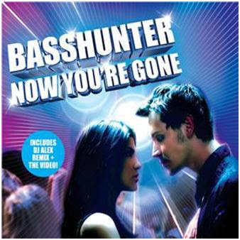
The positioning of the characters draws the audience into the scene and makes you feel as though you are there. The fact that they are at the forefront of the frame makes it seem like all the other people don’t matter. I think it’s also important to notice that it’s not the band themselves that feature on the cover.

The copy is in capital letting and easy to understand, we get all the information we need to know and we even get extra information featured on the front cover, making us feel as though we’re getting more by buying this single. I think that the elements of this effectively communicates the genre.


The blue and purple colours which bright white contrast gives the night club effect connoting the genre of dance. The target audience is clearly communicated by the two people featured on the front of the cover, young adults who can relate to these two characters. This makes it quite clear who the target audience are including the mise en scene featuring the night club scene behind.

There is no mode of address however the audience is immediately drawn into the scene. The audience isn’t spoken to by this cover directly, all they know is the small amount of copy featured however this makes them want to find out more.


There seems to be a message of ‘listen to this music and you could be this couple’ immediately grabbing the audiences attention and making them want to listen to the music. The image represents a stereotypical couple on a night out listening to the music by this band persuading the audience.


The image presented about the artist is that they are up to date, young and modern. The music is fast, upbeat and played on a night out which attracts the intended audience.These ingredients are common within the specific genre, the audience knows immediately the genre of music, the name of the band and the name of the song which is all the information that they are likely to want to know immediately.


The lines draw the audiences attention to the white spot ‘nothingness’ however on the back cover we are drawn to the title ‘Now You’re Gone’ as these characters literally are ‘gone’.


BACK COVER:
Again the colour scheme is carried on from the front of the cover, we have a similar copy in the same font and colour, standing out against the background. This seems extremely common with the genre.